


Setting up your ideal executive dashboard is a daunting task, but one that’s worthwhile given the productivity, efficiency, and profitability gains when done well.
That’s why I’ve written out explicit instructions for anyone using a Salesforce-based, or similar, management platform, such as the Propel platform, so you aren’t scared off before you even begin.
Wait! Have you reviewed Part I and Part II of our ongoing series designed to help you with all your executive reporting dashboard needs?
Let’s start building your perfect executive dashboard.
1. NPI Cycle Time Report
The NPI cycle time report is used to display the time between the project’s actual finish date and the actual start date. That’s it!
The Projects functionality in Propel makes reporting NPI cycle time really easy:
1. Select the Projects with Activities report.
2. This report will bring up ALL types of projects in Propel, and I recommend you just select the project types that are NPI-related. It’s common for customers to filter this by Project Type not equal to “”, as well as other non-NPI projects.
- You also need to filter out projects that are still in progress. Create a filter using either “Status equals Closed” or “Finish Date is less than TODAY.”
- You should also filter out any project templates by creating a filter “Template equals FALSE.”
3. In terms of the fields to see, I like having Project Name, Project Type, and Duration. It’s useful to group across Project Types, Product Lines, etc., so you can compare apples to apples.
To determine the average duration across your projects, you need to add a Summary Formula. Right-click on the Columns drop-down arrow, click Add Summary Formula, and then start typing “average” until you can select “Duration: Average.”
If you add a chart to this report, make sure to select Average for the X-axis instead of the default Sum of Duration.

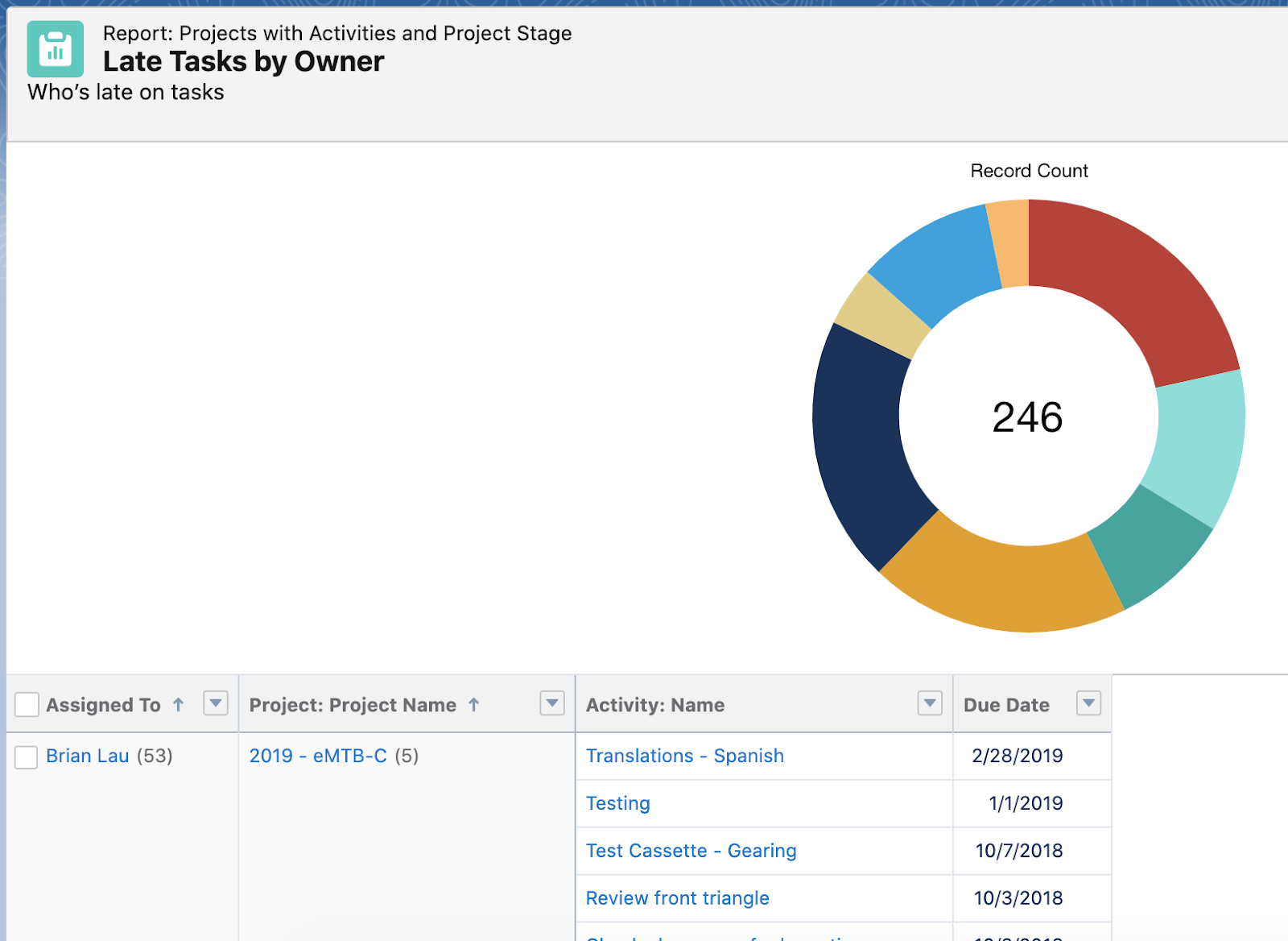
2. Upcoming or Late Tasks Report
In the Propel Project Reports folder, you will find the report Late Tasks by Owner, which groups late tasks by Owner, and then by Project. As I mentioned before, this is a handy report to include on each of your Project’s home pages, as well as on your exec dashboard.
Using this report as a template, you can make a few modifications to create the reports for My Late Tasks, Upcoming Tasks by Owner, and My Upcoming Tasks.
- My Late Tasks: Click Edit on the Late Tasks by Owner report, and add a filter Assigned To Me equals True. Instead of clicking Save, hit the arrow next to it and do a Save As. This is a report you may want to include on each user’s home page, so that when they log in, they’ll easily see what’s overdue.
- Upcoming Tasks by Owner: from the Late Tasks by Owner report, change the filter of Due Date from “Due Date less than TODAY” to “Due Date equals NEXT 14 DAYS” (or whatever time period you want).
- My Upcoming Tasks: combine the filters from the above two reports to create this report. This is also a good report to include on your users’ home page.
3. Change Cycle Time
This report is used for measuring the length of time it takes for a change to be managed. It can be tricky, so here are a few secrets.
SECRET #1: Select the Change Phases with Change report, and then group by Change Phase Name.
Update your filters to the following:
- Show me All Change Phases (instead of MY Change Phases)
- Change Phases Names not equal to Released, Incorporated (since changes can sit in these phases for a long time)
- Start Date not equal to “”
- Change Category equals ECO (unless it makes sense to compare cycle times across different types of changes)
SECRET #2: You can add the fields/columns of Start Date and End Date to your report to make it easier to see the data for each change. More importantly, you should add two Summary Formula fields: Total Lifecycle and Average Lifecycle.
- Follow the steps for a Summary Formula from the NPI Cycle Time report, but start typing “duration.”
- For the Total Lifecycle Summary Formula, select the value Duration in Days: Sum, and for Average Duration, select the value Duration in Days: Average. You may need to divide by 1440 (the number of minutes in a day) if you select the value that’s not measuring cycle time by days.
- You may notice that your phases are out of order, so your report reads Review, Draft, and Preliminary — instead of Draft, Preliminary, and Review. To fix that, you need to “rename” the phase names in the report. Create a row-level formula column and rename the phases with numbers in the front. For example, here’s a good formula to use:
CASE(CUST_NAME, “Initiation”, “1. Initiation”, “Submitted & Assigned”, “2. Submitted & Assigned”, “Submitted and Assigned”, “2. Submitted & Assigned”, “Investigation/Planning”, “3. Investigation/Planning”, “Implementation”, “4. Implementation”, “Implementation Verification”, “5. Implementation Verification”, “Effectiveness Check”, “6. Effectiveness Check”, “Final Approval”, “7. Final Approval”, CUST_NAME)
SECRET #3: Finally, if you add a bar chart, just like you did for the NPI Cycle Time report, make sure to select Average for the X-axis instead of the default Sum of Duration.
4. Supplier Issues
If you’re using Propel’s Quality features, you can easily create reports for your suppliers against different types of quality records. I recommend creating a separate report for SCARs, CAPAs, NCRs, etc., so that you’re not comparing apples to oranges.
- Select the Quality with Supplier report, and then group by Supplier Name. Adding a bar chart in descending order is a good way to visualize how your suppliers are doing. At a minimum, you should add these fields/columns to your report: Status, Title, Created Date, Approved Date, Closed Date. Many customers also have added Severity and Product Line, as well as other custom configured fields.
- For filters, add Category and Status. For Category, select the category you want to view (for example, Category equals NCR). For Status, you may want to filter out the quality issues that are already closed out, so create a filter Status not equal to Closed (or whichever lifecycle phase is appropriate for your business).
- You can use the Created Date to see how long a supplier quality issue has remained open, or similarly like the NPI Cycle Time report, you can add a formula field to calculate how many days an issue has remained open.
- If you want to see cycle times for closed quality issues, make sure to change the filter to Status equals Closed, and use a formula field of Closed Date - Created Date.
- Make sure you do a Save As for each of the quality categories that you want to report on.
5. Training Completion
If you’re using Propel’s Training features, you can easily see if any person is still late on their training assignments, but you can also do this by department.
- Select Training Plans with Training Assignments.
- Add a filter for Status equals Open, and make sure to Show Me All training plans. If you just want to see late assignments, create another filter like Late Tasks where the Due Date is less than TODAY.
- At a minimum, add the following fields: Description, Status, Due Date, Trainee Name, and Item.
If you want to report by department, here’s a clever idea that Inari Medical shared on a customer webinar: create a formula field on the Trainee object to pull the value from the Department field on the related user and use this field for reporting. Then just group by this field to see which departments have the most open assignments.
6. New Product Sales
This report relies on using Salesforce CRM/Sales Cloud (if you don’t have a Salesforce license, this is the one report I’ve listed here that you won’t be able to create).
I recommend creating a report for open pipeline as well as closed deals. There are multiple ways to create this report, but here’s one of the easier ways.
- Select the Opportunities and Items report. You need to make sure that on your Opportunity, you have a lookup field to the Propel Item Number. I also like to create a custom field on the Item called Launch Date, and then use a lookup to that field on the Opportunity.
- When you create the report, make sure you have Item Number as one of the columns/fields, while adding and removing whatever fields suit your business. Good fields to include would be Opportunity Name, Customer Name, Close Date, Amount, Stage, and Item Number.
- You then want to go to your Filters, and use the Launch Date to screen out older products. I recommend using a relative date like “Launch Date equals THIS YEAR.”
You can further tailor this by adding in regions, product lines, etc. to give you a better sense of how your new products are selling.
7. Customer Complaints
Similar to the Supplier Issues report, this report pulls customer issues. You’ll, of course, need to have configured a Complaint object. To do this, instead of selecting the Quality with Supplier report, choose Quality with Customer.
If you’re using Salesforce Service Cloud, you can create this report starting from the initial customer case and then associating it with the complaint object in Propel. This will allow you to see information like how long it takes from the very beginning of a customer logging an issue until when the incident is actually closed with the customer. You can also see which customers or regions are having the most issues.
To create this report, select the Cases and Quality Incident report, and then add fields for Case Number, Case Closed Date.
8. Certification Status
Propel’s specifications and declarations features are a great way to keep on top of your certification for RoHS, CE, UL, you name it.
- Select the report Compliance Statuses with Item Revisions.
- Besides changing the filter to Show Me All Compliance Statuses, you should add a filter Item Revision: Is Latest Released equals True. This will show you the most recent items you have out. If you want to look at all revisions, just remove this filter.
- You’ll next want to add the fields/columns of Specification, Calculated Status and/or Declared Status, and Item Revision: Release Date.
I like to group by the Item Number, so you can see what's still missing for specific items, but some customers prefer grouping by specification if there’s a team member who owns each specification.
Putting It All Together
Now that you have your reports ready, you’re just a few minutes away from your up-and-running executive dashboard.
Here’s how to bring them all together: Go to the Dashboards tab, click New, name your dashboard, and click “+ Component” to start adding the reports you’ve just created.
Your most recent reports will be listed, but as you add them, notice that they’re stacked vertically. Just drag and drop, resize, etc. to create the perfect dashboard for your company.
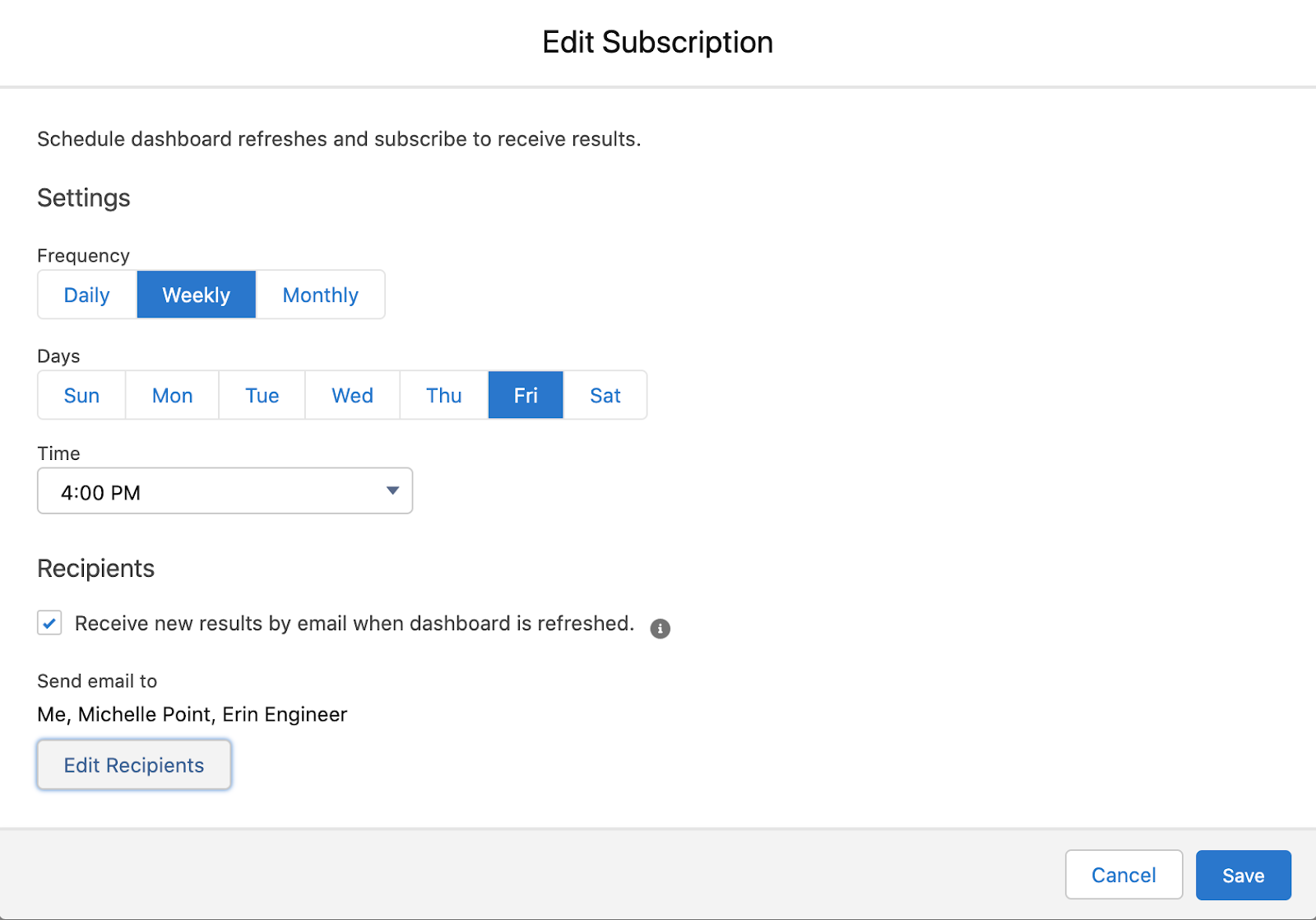
On top of setting your dashboard to be the first thing your team sees when they log in, you can also send out periodic snapshots to your team.
Here’s how:
- On the Dashboard list view, right-click on the drop-down arrow for any dashboard and click Subscribe.
- Then determine the frequency, timing, and recipients who will get a dashboard notification.
You’re now ready to go with your own executive dashboard! Happy tracking!


.png)


